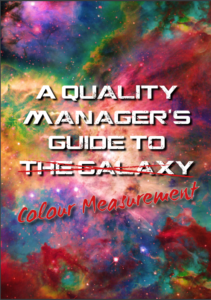
Written & Designed by our very own Rachael Stothard
Please click to download a PDF copy
In the beginning, humans would eat the food they eat, wear the clothes they wear and use the items they would use without much regard to what they really looked like. Nowadays, the first indication of quality of a product begins with how it looks; is it the right size and shape?
Does it look like what it is supposed to? Is it the right colour?
If you go into a supermarket and buy washing powder, you would expect it to be white. If you opened the box and found it was yellow, chances are you wouldn’t be using it at all and may be a bit peeved you spent your money on it.
Fast forward to the present day and you will find that there are these wonderful people called “Quality Managers” whose role in life is to make sure that things look how they should; that washing powder is as white as fresh snow or that tomato ketchup is that perfect shade of tomato-ey red that creates an artistic fusion of colour when lathered over chips (as well as being tasty, obviously).
Their job is to be the scrutinisers of perfection; the Kings and Queens of quality; the… other metaphorical entity that indicates they are really into quality control. It is the duty of a Quality Manager to supervise the product that they are responsible for and make sure everyone can see the high quality that they aspire to. The problem is that these Quality Managers normally end up with many, many problems that pile up on their desks.
Some of these problems normally contain the words “colour” and “appearance” and “wrong” as well as some choice others and can be quite repetitive, so Quality Managers end up with a lot of headaches.
Now, we’ve been about a bit in the colour and appearance world and, using the knowledge and experience we have with regards to public perception of quality, we have come up with 9
reasons to measure colour. (There used to be 10 but we thought “common sense” was a little too obvious to require being written down as an official reason, but if you would like to include it, be my guest).
We also understand how humans see colour and how we can use really clever instruments called Colorimetric Spectrophotometers to quantify what we see. All this will also be explained in this reference guide. We like Quality Managers and want to provide them with many solutions for their colour and appearance quality problems so we have used our knowledge to create this masterpiece. Hopefully it will prove useful but, if you are a pessimistic soul and don’t believe that perfect colour and appearance quality can be achieved, you don’t have to carry on reading. If you don’t want to stop quality problems before they occur, pop this book into a drawer so it will be safe and ready for you when you need it.
If you have a 100% flawless, perfected process then… can we come and visit to learn what magic you possess? No process in any industry is perfect so that would be pretty amazing!
That’s the aim of this book: helping you to achieve the unachievable. Giving you the knowledge of colour and appearance to work out a way to make it work for you. Oh, and I should also add, if you’ve got any questions about anything you read in this handy little book, we’ve popped some contact details at the end; feel free to use them. (Preferably for colour related questions only but you can always try and throw us off and ask an astronomy or baking question if you fancy it.)
If you would like to learn more or to demo a solution to help bring the cost of running your process down please Contact us here or complete the form below:


